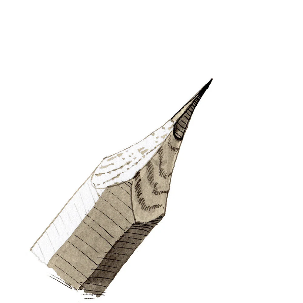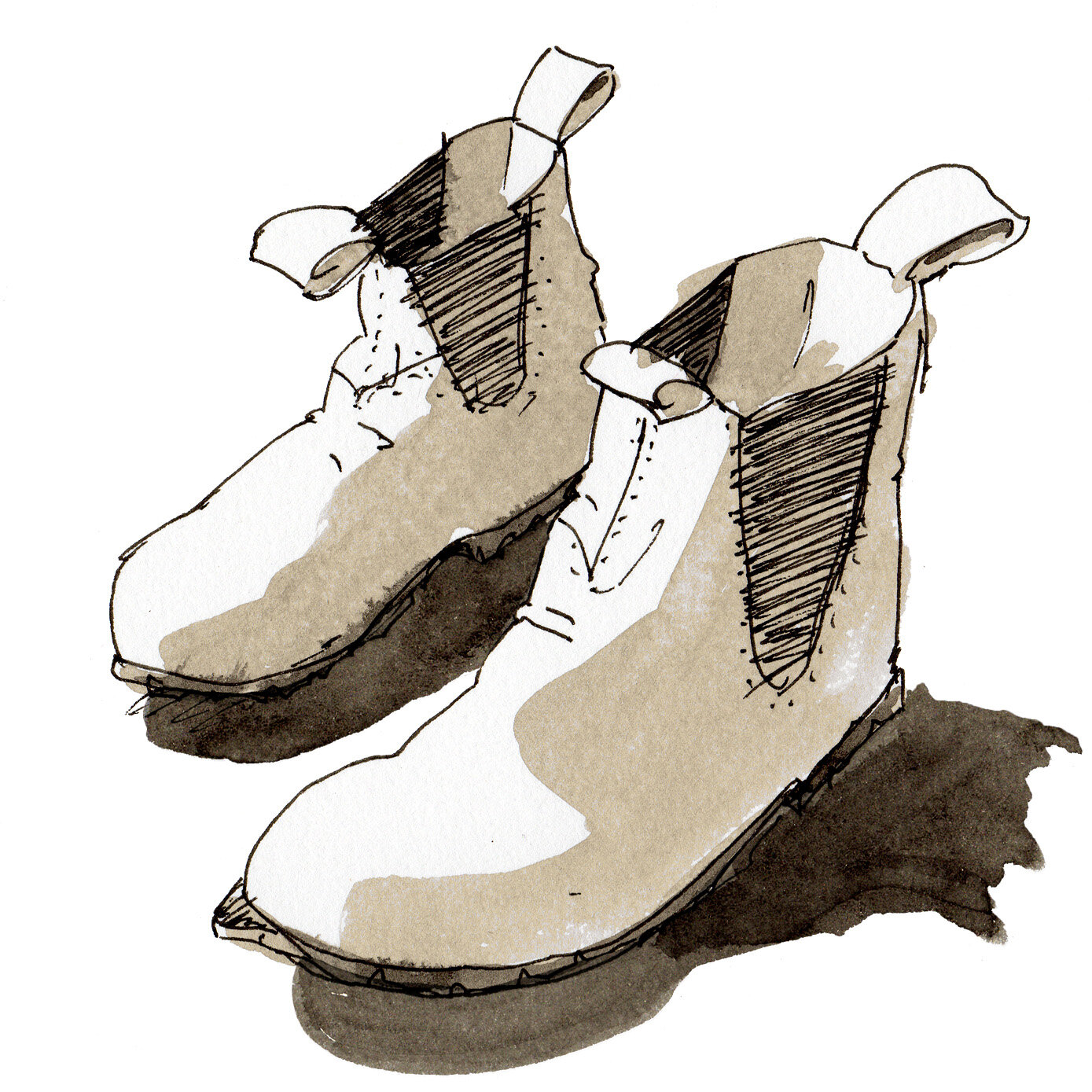
Thematic spot illustrations
Small spot illustrations, inspired by architecture and design themes, to serve as identity, branding & navigation aids on a website.
The process
Context: Saneia, an experienced landscape designer, was launching a new business (SNDC) that would help teach improved verbal communication for an audience who are mostly visual people.
Brief: SNDC needed navigation icons & spot illustrations that would catch the attention of an audience comprised mostly of architects & landscape designers.
Collaborators: Saneia Norton provided me a recommended list of visual concepts. With some adjustments, we locked in a set of images to work with.
James Norton Design took those illustrations and built them into a website design and brand identity. (Preview below).
Approach: Part of our goal was to have drawings that would feel familiar to architects, who are always scribbling away and sketching out ideas on rolls of yellow trace.
I selected inks, markers, and paper stocks that could replicate that feeling.
Result: The final spot illustrations provide consistency, brand recognition and visual interest across the SNDC website, and also at her many public workshops and presentations.


